

New dashboard identifies ‘hot spots’ for COVID-19 at local and state levels
A team of researchers from Texas A&M University and North Carolina State University has created an online dashboard, the COVID-19 Pandemic Vulnerability Index (PVI) to assist local, state and federal authorities in making decisions about “hot-spots” in COVID-19.
“The response from the scientific community to the COVID-19 pandemic has been enormous and the information that becomes available on different aspects of the disease spread are now available and useful,” said Ivan Rusyn, director of the Texas A&M Superfund Research Center and a professor in the College of Veterinary Medicine & Biomedical Sciences’ Department of Veterinary Integrative Biosciences.
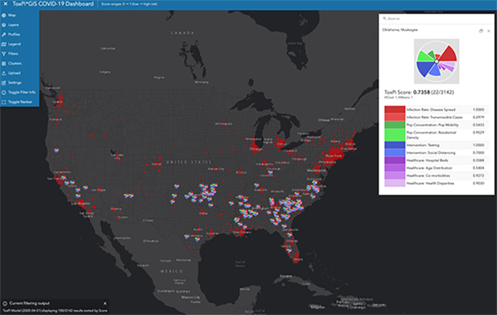
Where the COVID-19 PVI Dashboard is different from other attempts to synthesize data for local leaders and the public is that it gives each county a concise “vulnerability scorecard,” which integrates multiple vulnerability indicators related to infection status, mitigation efforts, and pandemic-related vulnerabilities. The team adapted the web-based, decision-support dashboard ToxPi*GIS for the COVID-19 response.
Globally, there is a general road map for the steps in addressing the pandemic, and in the United States, everyone is still at the first step—trying to reduce the spread of the virus through social distancing. However, it can be difficult for localities to understand how such interventions are reducing their vulnerability to continued infections.
Additionally, the time will eventually come to start gradually easing restrictions. But deciding when and where to begin that process is going to be very difficult. State and local leaders will have to closely monitor for disease resurgence while considering the capacity of their local healthcare system.
“Our approach is to integrate these complex data and to communicate the results through easy to understand county-level scorecard,” Rusyn said.
For state leaders, the dashboard can help identify current and, more importantly, potential “hot spots,” which will assist in prioritizing resources.
“The main limitation of most of the online maps currently available is that they are looking in the rear-view mirror, especially due to the long incubation period of COVID-19,” said another team member, Weihsueh Chiu, professor, Department of Veterinary Integrative Biosciences. “We aim to fill this gap by developing a vulnerability index to identify potential future hot spots and, thus, help decision-makers initiate, intensify, or relax interventions as appropriate.”
The team is seeking input from local officials and experts to continue to refine the dashboard and its functionality to best support decision-making.
“Moreover, all of our software and results are fully open source and transparent,” Chiu said, “and we invite outside scrutiny to help us make rapid updates and improvements.”